Pandas Dataframe
Creating a DataFrame Object in Jupyter Using Pandas
In Jupyter, you can create a DataFrame object using the Pandas library. Once you have a DataFrame, you can perform a variety of operations to view or manipulate the data.
1. Displaying the Entire Data
The following command will display the complete data in a tabular format:
"object_name"2. Displaying the First n Rows
To view the first 'n' rows of the DataFrame, use the head() function:
"data.head(n)"3. Displaying the Last n Rows
Similarly, to view the last 'n' rows of the DataFrame, use the tail() function:
"data.tail(n)"Descriptive Statistics of Data
Statistical Analysis in Pandas DataFrame
Minimum and Maximum Values
The minimum and maximum values provide an expected range within which the values of a variable are likely to lie.
They also help identify outliers and can highlight potential errors or anomalies in the data.
Mean
The mean represents the average value for numeric data.
Quartiles and Data Spread
The three quartiles (25%, 50%, and 75%) represent the spread of the data.
Uniform Spreading of Data
If the distance between the following points is similar, the data is uniformly spread:
- Minimum value and first quartile
- First quartile and second quartile
- Second quartile and third quartile
- Third quartile and maximum value
Standard Deviation
The standard deviation measures the spread of data around the mean or average value.
- Low standard deviation means most of the values are close to the average value.
- High standard deviation means the values are spread out.
Descriptive Statistics
To get a summary of descriptive statistics for all numeric columns, use the following command:
"data.describe()"This will return statistics such as:
- Count
- Mean
- Standard deviation (std)
- Minimum value (min)
- 25% (first quartile)
- 50% (median or second quartile)
- 75% (third quartile)
- Maximum value (max)
Descriptive Statistics for Categorical Columns
To get descriptive statistics for both numeric and categorical columns, use:
"data.describe(include='all')"For string variables, this will return:
- Count
- Unique values
Data Information
To get information about the variables (columns) in the DataFrame, use:
"data.info()"- The Range index shows the total number of entries in the DataFrame.
- If the non-null data count is less than the range index count, the difference represents missing data.
- Missing data count can be calculated as:
Range Index count – Non-null data count
Calculating Specific Statistics for a Variable
To calculate specific statistics for a column (variable), use the following commands:
"data['variable name'].mean()"returns the mean of the specified variable."data['variable name'].min()"returns the minimum value of the specified variable."data['variable name'].max()"returns the maximum value of the specified variable."data['variable name'].std()"returns the standard deviation of the specified variable."data['variable name'].quantile(.25)"returns the 25th percentile (first quartile) of the specified variable."data['variable name'].quantile(.50)"returns the 50th percentile (second quartile/median) of the specified variable."data['variable name'].quantile(.75)"returns the 75th percentile (third quartile) of the specified variable."data['variable name'].unique()"returns a list of all unique values in the specified column (often used for categorical variables).
Numpy: A Statistics Module in Python
NumPy is a powerful library in Python, primarily used for numerical computing. It provides essential functions for performing statistical operations on data.
Key Functions in NumPy for Statistical Analysis
- np.mean(): This function calculates the mean (average) of an array or a list.
np.mean(data)np.median(data)np.std(data)np.var(data)np.min(data)np.max(data)np.percentile(data, 25)np.percentile(data, 25)np.quantile(data, 0.25)Additional Statistical Operations
- np.corrcoef(): This function calculates the correlation coefficient between two or more variables.
np.corrcoef(data1, data2)np.cov(data1, data2)Using NumPy with DataFrames
NumPy is frequently used in conjunction with pandas to perform fast statistical computations on large datasets. For example, we can apply NumPy statistical functions to a column in a pandas DataFrame:
import pandas as pd
import numpy as np

# Example DataFrame
data = pd.DataFrame({
    'Age': [25, 30, 35, 40, 45],
    'Salary': [50000, 60000, 65000, 70000, 75000]
})

# Applying NumPy functions to DataFrame columns
mean_age = np.mean(data['Age'])
median_salary = np.median(data['Salary'])
std_age = np.std(data['Age'])

print(f"Mean Age: {mean_age}, Median Salary: {median_salary}, Standard Deviation of Age: {std_age}")
Conclusion
NumPy is an essential library in Python for performing statistical operations. Its functions are optimized for efficiency and can be used with both small and large datasets to gain insights through basic descriptive statistics and advanced statistical analysis.
Matplotlib: Graph Plotting
Matplotlib: Graph Plotting
Matplotlib is a widely used Python library for creating static, animated, and interactive visualizations. It provides a variety of plotting functions to represent data graphically.
Basic Plotting in Matplotlib
The most common type of plot in Matplotlib is the line plot. You can create
line plots using the plt.plot() function.
import matplotlib.pyplot as plt

# Example data
x = [1, 2, 3, 4, 5]
y = [2, 3, 5, 7, 11]

# Create a line plot
plt.plot(x, y)

# Display the plot
plt.show()
This will display a simple line plot with the data provided in x and
y.
Types of Plots in Matplotlib
- Line Plot: A simple plot that shows data points connected by straight lines.
plt.plot(x, y)plt.scatter(x, y)plt.bar(x, y)plt.hist(data, bins=10)plt.pie(sizes, labels=labels)Customizing the Plot
Matplotlib allows customization of various aspects of the plot, such as titles, labels, and colors.
- Title: Add a title to the plot using
plt.title()
plt.title('My Plot Title')plt.xlabel() and plt.ylabel()
plt.xlabel('X-Axis Label')plt.ylabel('Y-Axis Label')plt.grid(True)plt.grid(True)linestyle and color parameters.plt.plot(x, y, linestyle='--', color='r')Multiple Plots in One Figure
You can plot multiple graphs in a single figure using plt.subplot() to specify
the grid layout.
plt.subplot(1, 2, 1)  # (rows, columns, index)
plt.plot(x, y)
plt.title('Plot 1')

plt.subplot(1, 2, 2)
plt.scatter(x, y)
plt.title('Plot 2')

plt.show()
Saving the Plot
Once you've created a plot, you can save it to a file using plt.savefig().
plt.plot(x, y)
plt.title('My Graph')
plt.savefig('my_graph.png')
This will save the plot as a PNG file named "my_graph.png" in the current working directory.
Conclusion
Matplotlib is a powerful tool for visualizing data and generating various types of plots to understand data distributions, relationships, and trends. By customizing your plots, you can tailor them to meet your specific needs and better communicate your insights.
Pandas: Some important Functions
Pandas: Advanced Functions
Pandas is a powerful Python library for data manipulation and analysis. Beyond basic data handling, it offers advanced functions to perform complex operations on data.
1. GroupBy Functionality
The groupby() function is used for splitting the data into groups based on some criteria (e.g., a column or a set of columns), applying a function to each group, and then combining the results.
df.groupby('column_name').mean()This will return the mean of each group for the specified column.
Other GroupBy Operations
- Count:
df.groupby('column_name').count() - Sum:
df.groupby('column_name').sum() - Standard Deviation:
df.groupby('column_name').std() - Custom Functions:
df.groupby('column_name').agg({'col1': 'sum', 'col2': 'mean'})
2. Pivot Tables
Pivot tables are useful to summarize data by creating cross-tabulations. This function allows you to transform and aggregate your data.
df.pivot_table(values='value_column', index='row_column', columns='column_column', aggfunc='mean')This creates a pivot table where values are aggregated by the aggfunc (e.g.,
mean).
3. Merging DataFrames
Pandas provides multiple ways to merge two DataFrames, such as merge(), join(), and concat().
Merge
The merge() function combines two DataFrames on a common column or index (like SQL joins).
df1.merge(df2, on='common_column', how='inner')- how: Specifies how to merge the DataFrames. Options include:
'inner'(default): Only the intersection of both DataFrames will be included.'outer': Union of both DataFrames will be included.'left': All records from the left DataFrame.'right': All records from the right DataFrame.
Concat
concat() is used to concatenate multiple DataFrames along a particular axis (rows or columns).
pd.concat([df1, df2], axis=0)Here, axis=0 will stack the DataFrames vertically (row-wise). To stack
horizontally, use axis=1.
4. Handling Missing Data
Pandas provides powerful tools to handle missing data.
Removing Missing Data
- Drop missing rows/columns:
df.dropna() - Drop columns with missing values:
df.dropna(axis=1)
Filling Missing Data
- Fill with a specific value:
df.fillna(value=0) - Fill forward:
df.fillna(method='ffill') - Fill backward:
df.fillna(method='bfill')
5. Apply Function for Row/Column-wise Operations
Use the apply() function to apply a function along the rows or columns of a DataFrame.
df.apply(np.sqrt, axis=1)This will apply the square root function to each row.
6. Window Functions
Window functions allow you to perform operations over a sliding window. For example, calculating moving averages.
df['rolling_mean'] = df['column_name'].rolling(window=3).mean()This creates a new column with a rolling mean (moving average) over a window of 3 rows.
7. Categorical Data Operations
Pandas provides support for categorical data types, which can improve memory usage and computation speed.
df['category_column'] = df['category_column'].astype('category')You can also perform operations like sorting and counting unique categories:
- Count unique categories:
df['category_column'].value_counts() - Sort by categories:
df['category_column'].sort_values()
8. Time Series Analysis
Pandas is also powerful for time series analysis. It provides functionality for working with datetime data and performing time-based aggregations and transformations.
Creating Date Range
date_range = pd.date_range(start='2022-01-01', periods=10, freq='D')This creates a range of 10 dates starting from January 1, 2022, with a frequency of 1 day.
Resampling Time Series
Use resample() to group time series data by a specific time frequency (e.g., monthly, weekly).
df.resample('M').mean()This will resample the time series data by month and calculate the mean for each month.
9. Vectorization with Pandas
Pandas operations are optimized for performance using vectorized operations. Avoid looping over DataFrame rows manually, as this is much slower than using Pandas built-in vectorized methods.
df['new_column'] = df['column1'] + df['column2']This will add the values in column1 and column2 without needing a
loop.
10. Chaining Operations
Pandas allows chaining operations to perform complex data transformations in a more readable and efficient way. However, be careful with it as it may sometimes lead to issues with memory and performance.
df.dropna().groupby('category_column').mean().sort_values(by='value_column', ascending=False)Conclusion
These advanced functions in Pandas allow you to perform complex data manipulations, aggregations, and transformations efficiently. By mastering these techniques, you can handle and analyze data at a much deeper level.
Univariate Analysis
Univariate Analysis
Univariate analysis refers to the analysis of a single variable to summarize and find patterns in the data. It involves examining the distribution, central tendency, variability, and other statistical properties of the variable.
1. What information does this variable represent?
This question is aimed at understanding the meaning or significance of the variable. It is important to clearly understand what the variable represents in the context of the data. For example, it could represent a person's age, a product's price, or a customer's purchase behavior.
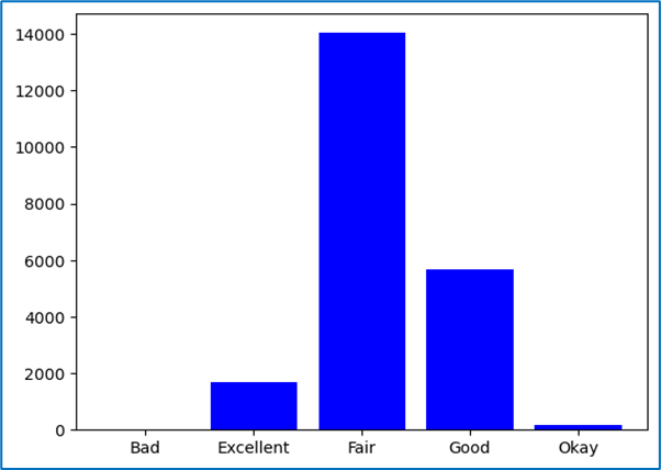
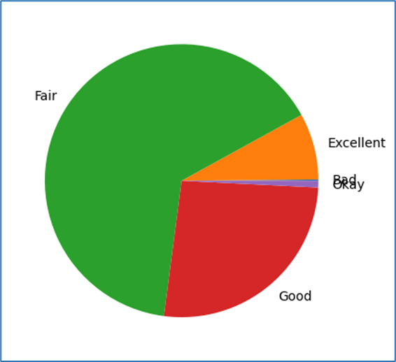
2. What is the data type for this variable?
It is essential to know the data type of the variable because it determines how the data is analyzed. Data types can include:
- Numeric: Continuous (e.g., age, salary) or Discrete (e.g., number of products sold).
- Categorical: Ordinal (e.g., rankings) or Nominal (e.g., gender, color).
- Boolean: True/False values indicating presence or absence of a feature.
- Datetime: Represents time-based data.
3. Do the few sample values we can analyse without any computation help make sense?
Before performing any complex computations, it's helpful to check a few sample values from the data to ensure they make sense. For example, if you are analyzing ages, you should not see negative numbers or values greater than 100 unless the data is clearly incorrect or out of the expected range. Spotting such issues early can save time and effort during the analysis.
4. Does the statistical description (mean, median, max, min, standard deviation, etc.) make any sense?
It's crucial to look at basic statistical summaries to check if they make sense:
- Mean: The average value of the variable.
- Median: The middle value when the data is sorted. It helps understand skewness in the data.
- Max and Min: The highest and lowest values in the data.
- Standard Deviation: Measures the spread or variability of the data.
- Quartiles: Divide the data into four equal parts (25%, 50%, 75%).
If the mean is much higher than the median, this suggests positive skewness. If the standard deviation is very high, it indicates that the data has a wide spread.
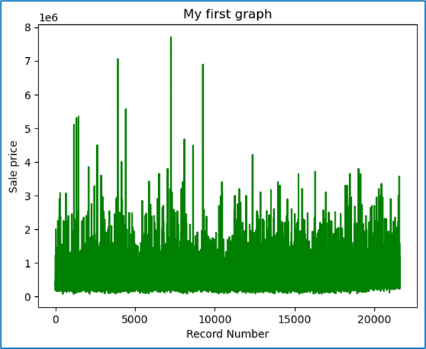
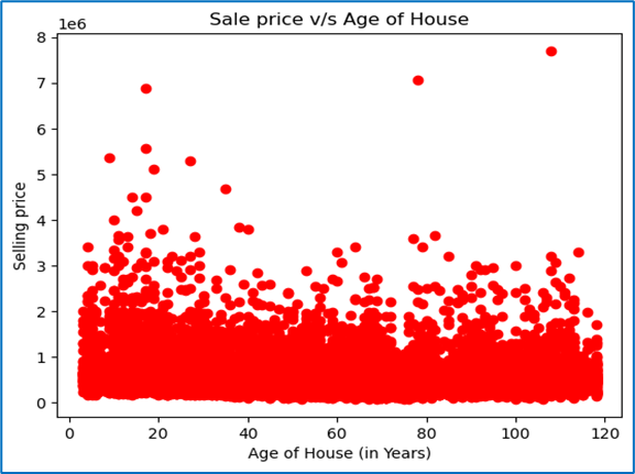
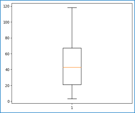
5. Do the target variables contain any outliers that we need to treat?
Outliers are values that are significantly higher or lower than the majority of the data. Identifying and treating outliers is an essential part of data cleaning because they can affect statistical calculations and the quality of model predictions. Techniques to identify outliers include:
- Boxplots: Visual representation to identify outliers outside the interquartile range (IQR).
- Z-scores: A Z-score greater than 3 or less than -3 can be considered an outlier.
- Quantiles: Observing values beyond the 1st or 99th percentile.
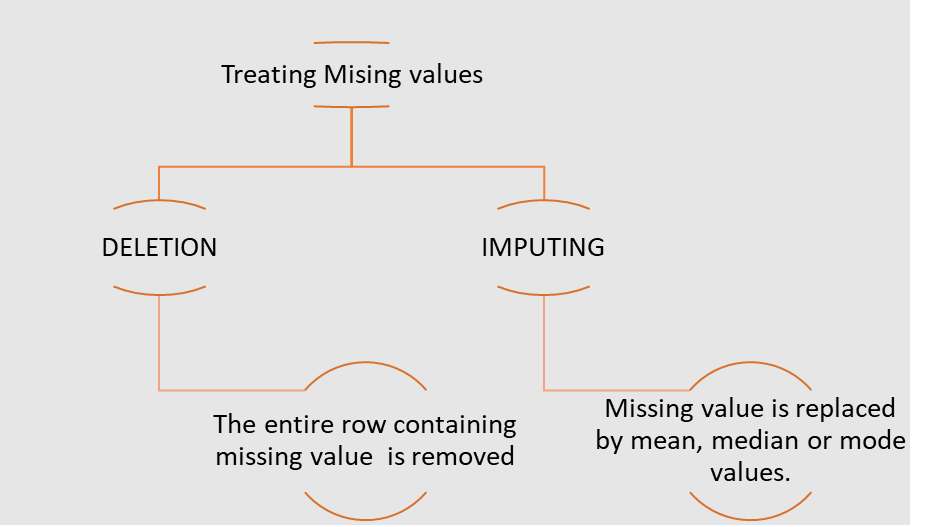
6. Are there any missing values in the target variable?
Missing values in the target variable (or any variable) need to be addressed. These missing values can be imputed or removed based on the context and the proportion of missing data. Some common techniques for handling missing data are:
- Imputation: Fill in missing values with the mean, median, or mode.
- Forward or Backward Fill: Use the previous or next available value to fill missing values in time series data.
- Deletion: Remove rows with missing values (only if the missing data is minimal).
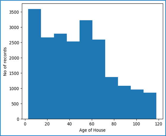
7. What is the distribution of the target variable over its range: Normal or skewed?
Understanding the distribution of the target variable is important because it affects which statistical methods and algorithms to use:
- Normal Distribution: Data that follows a bell-shaped curve, where most of the data points are clustered around the mean.
- Skewed Distribution: Data that is not symmetrically distributed. If data is right-skewed, the tail is to the right, and if left-skewed, the tail is to the left. Skewness can affect statistical analyses.
- Visualizing the Distribution: Use histograms, density plots, or boxplots to visually inspect the distribution.
- Checking Normality: You can use tests like the Shapiro-Wilk test or D’Agostino’s K-squared test to check if the data is normally distributed.
In many cases, if data is skewed, it might be transformed (log transformation or square root transformation) to make it more normal, which can help in building more reliable models.
Conclusion
Univariate analysis is a critical first step in understanding individual variables in your dataset. By answering these questions, you can uncover important insights, spot potential issues like outliers or missing values, and decide on the next steps for analysis or modeling.
Treating Outliers
OUTLIERS
An outlier is a data point that is distant from other data points. Its value lies outside the usual range of the rest of the values in the data, hence the term outlier.
There can be data points whose absolute values are within the range, but when viewed in the context of other information or variables, the data point may be an outlier.
Strictly speaking, outliers are data points that are very distant from the rest of the observations.
Mathematically, outliers have data values either less than the lower limit or higher than the upper limit:
- Lower limit = minimum values – IQR
- Upper limit = maximum value + IQR
The Seaborn library of Python has the capability to ignore missing values and create box plots easily.
Why Outliers Occur?
- Outliers can occur due to genuine variability in the data or due to errors in the recording of data.
- Outliers cause serious problems in statistical analysis of data.
- Outliers substantially change the perception of data by altering the statistical values and hence produce wrong predictions.
Treating Outliers
Different Ways of Treating Outliers
- Deletion:
In this method, we remove the entire row. This results in a reduced data size, and valuable information can be lost. However, it does not cause significant loss in large datasets.
- Capping or Imputing:
Outliers are replaced with the average value, median value, mode value, or the limit values, whichever makes the least impact on the variable.
- Data Transformation:
Transform the variable to its log, square, or cube root. Since the log, square, or cube root of an outlier is likely to fall within the range of the log, square, or cube roots of the rest of the data points.
- Binning:
Different bins are formed based on the values of variables, and outliers are treated accordingly.
Treating Missing Values
NOTE: Note: Deletion is preferred over Imputing as any model learns from target variables and hence via imputing it would learn not from actual data but inferred one. For independent variables imputation is preferred
The fit transform function is defined in Simple-Imputer file in the Impute module from the Sklearn library. We can create an imputer object using the Simple-Imputer function that takes two arguments. Missing values: These are the values which are to be imputed. Strategy: This is the function or method applied to impute the values Thenn the fit transform function is called on the imputer object with argument containing array of variables on which imputation is to be done.
Correlation
Correlation is a measure of dependence or association between two variables, i.e., how one variable changes in relation to the other.
Correlation can be of three types:
- Positive correlation: Directly proportional
- Negative correlation: Inversely proportional
- Zero correlation: No pattern of relation
Graphically, correlation can be observed via a scatter plot, whereas mathematically it is calculated using the correlation coefficient, usually denoted by r.
The correlation coefficient, r, can take any value between -1 and 1:
- r ∈ [-1, 1]
- Positive correlation: r ∈ (0, 1]
- Negative correlation: r ∈ [-1, 0)
- Zero correlation: r ∈ 0
In Python, we can find the correlation coefficient using both Pandas and NumPy:
- Pandas: The function
variable1.corr(variable2)will return a real value between -1 and 1, which is the correlation coefficient. - NumPy: The function
numpy.corrcoef(variable1, variable2)will return a matrix of correlation coefficients.
The function data.drop(columns = []).corr() can be used to get a matrix of
correlation coefficients for the data variables on both the x and y axes. Note that the
diagonal values will always be 1, as any variable has a direct relationship with itself.
From this correlation matrix, we can identify which variables have a strong correlation with our target variable. Only those variables that show a high correlation (either positive or negative) with the target variable should be selected for building the model.
Important Note:
If two independent variables are highly correlated with each other and also with the dependent variable, using both variables in the model may result in a suboptimal or poorly understood model. In such cases:
- The model will most likely use only one of those highly correlated variables in the equation, considering the other variable statistically insignificant.
- The predictive power of the other variable is already explained by the first variable.
- Between the two highly correlated variables, the correct one must be chosen.
ANOVA
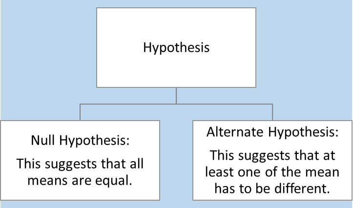
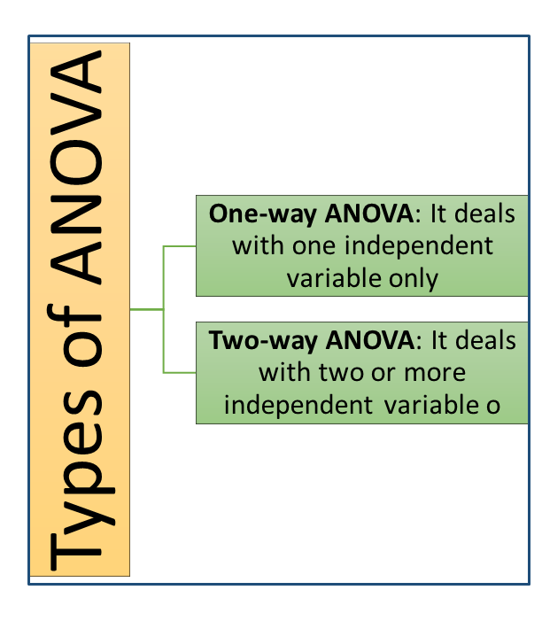
ANOVA (Analysis of Variables)
ANOVA stands for Analysis of Variables.
It checks if the mean of the target variable across the unique values of a categorical variable are equal or not.
When we apply ANOVA, we have a certain hypothesis regarding the result.
Values Obtained from ANOVA
- F-value: A large value.
- P-value: If
p-value < 0.05, it means there is less than a 5% probability that the difference in means is purely a coincidence. Or, we can say there is a 95% chance that the difference in means actually exists.
ANOVA can tell whether a categorical variable impacts the target variable or not, but it cannot determine the strength of the impact.
Treating Categorical Variables
Sometimes, we have to treat categorical variables like numerical variables in order to operate with them. This process of transforming a categorical variable into a set of numerical or Boolean variables is called creation of dummy variables.
The number of dummy variables depends on the number of unique values in the categorical variables.
- If a categorical variable has n levels, then the number of dummy variables required is n-1, as the last variable’s value can be deduced by the other n-1 values already.
The get_dummies function of Pandas is used to generate dummy variables.
If the number of levels for a categorical variable is high, we use another technique called Binning.
Binning Technique
In the Binning technique, we follow these steps:
- Create a list of bin-variables for the categorical data.
- Use the
cutfunction of Pandas to place the desired column’s values into appropriate bins. Usually, in this step, we create a new table or data frame. - Merge the original table and the new table.
- To make the data frame clean, delete (or drop) columns that are duplicate or unnecessary.
- After completing the above steps, we can create dummy variables.
Creating Training Datasets
Separating Dependent and Independent Variables
Dependent variables are split into a separate data frame called Y.
Independent variables are split into a data frame called X.
To separate the data frames, we use the function iloc.
Note that iloc does not include the last index from the index range.
Training and Testing Data
Training data is the data on which a model is built. This is the data from which the model learns, where both output and input are known.
Test data is a subset of the original data used to examine how well the model has learned. The model predicts the target variable values for the test data, and then the predicted values are compared with actual values to check how many of them were correctly predicted.
Split Ratio
The Split Ratio is defined as:
- Split ratio = (% size of train data) / (% size of test data)
The split ratio changes based on the size of the original datasets and the problem statements. The ideal split ratio is usually 70:30 (i.e., 70% training data and 30% test data).
Both dependent and independent datasets, X and Y, are split into train and test datasets. Hence, we get 4 datasets:
- X_train: Independent training data
- X_test: Independent test data
- Y_train: Dependent training data
- Y_test: Dependent test data
To achieve this in Python, we use the train_test_split function from the
model_selection module of the sklearn library.
FeatureScaling
FEATURE SCALING
Feature scaling refers to the process of scaling all the feature variables (or independent variables) to the same range.
Note that the variation in magnitude and range of features causes two problems:
- Variables with higher magnitude and range will have more impact compared to those with smaller ranges.
- Due to this, the model might not predict properly since it is not giving equal weight to both the variables.
The gradient descent algorithm used to find the coefficients of linear regression may take a long time to converge.
To overcome these problems, the variables are scaled to have similar magnitudes and ranges so that the model is not biased towards a particular variable.
This procedure becomes more important in algorithms where some measure of distance between data points is involved, like:
- Logistic Regression
- Linear Regression
- K Nearest Neighbours
- Principal Component Analysis (PCA)
However, this procedure is not required for tree-based algorithms.
Methods of Feature Scaling
- Standardisation
It rescales the feature values so that they have the properties of a Standard Normal Distribution with mean 0 and standard deviation 1.x' = (x - μ) / σwherex'is the new value,xis the old value,μis the mean, andσis the standard deviation. - Min-Max Scaling
The value range for the transformed variables lies between [0, 1].x' = (x - min(x)) / (max(x) - min(x)) - Normalisation
The range is fixed from -1 to +1. It is also called mean normalization.x' = (x - μ) / (max(x) - min(x))
Feature Scaling in Python
Standardisation method should be used for scaling the feature variables when building a linear regression model. A linear regression model assumes the input variables to be normally distributed.
The pre-processing library of Sklearn can be used to perform standardisation.