Graphical & Analytical Representation of Data
Data Analysis & EDA
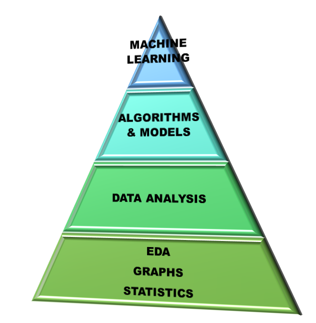
Data Analysis is the process of studying the available data and drawing valuable insights or information from it with the help of any software. Commonly used analytical tools in industry are: MS excel, python, R, sas, knime, SPSS, Minitab 18, MATLAB, Tableau etc. ML models use data analyses to analyse the input data. Hence data analysis is the part of processing of an ML procedure.
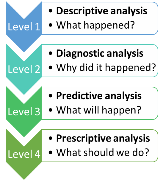
Exploratory Data Analysis is a type of Data analysis which is used to find out the patterns and relationships among the data variables. EDA gives the summary of dataset in form of graphs. The figure on left side shows the levels of Data Analysis. In descriptive analysis we try to extract information from already available data. This gives us a high-level picture of the dataset.
Graphical Representation of data
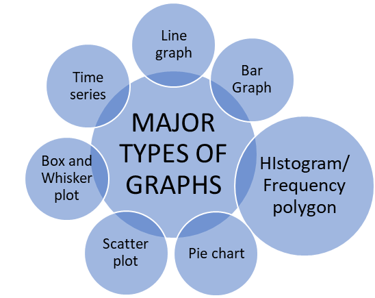
Graphical Representation of Data:
• It is one of the simplest techniques for drawing insights from the data.
• Helps us to study the relationship between the variables.
• Helps to identify the trends and patterns across the variables.
Line Graphs:
- Two dimensional graphs
- Horizontal axis (or X-axis) marks the independent variables whereas vertical axis (or Y-axis) marks the dependent variables.
- Data points are marked according to the (x, y) coordinate values.
- Data points are joined by a line to obtain the line graph.
Bar Chart:
- Two dimensional graphs
- Horizontal axis (or X-axis) marks the independent variables whereas vertical axis (or Y-axis) marks the dependent variables.
- Data points are marked according to the (x, y) coordinate values.
- Data points represented by bars either horizontally or vertically.
Histogram or Frequency Polygon:
- Two dimensional graphs
- Special type of bar chart.
- Used to represent continuous variables only.
- Used to count the frequency of occurrence of an event.
- If we join the data points in a histogram, we obtain a smooth curve.
- If a bell-shaped curve is obtained, i.e., y-values first increased, attained a maximum value and then decreased. In this type of curve, we say the data is Normally Distributed.
- For ML-data modelling the data must be always normally distributed.
Pie Chart:
- Graph simulating the share of a complete circle.
- Each part of the circle describes the share of the variable in the graph.
- It is widely used when we want to present the proportions of different attributes.
Scatter Plot:
- One of the most useful graphs in machine learning.
- A scatter plot is a two-dimensional graph in which each point is obtained by the intersection of the values of respective x and y values.
- Informs us the relationship between two variables.
- Sometimes we draw a line in between the curve such that it represents all the data in the best way possible. Such a line is called the best fit line.
Box and Whisker Plot:
- Box plot, also known as Box and Whisker plot, is a graphical representation of the statistical summary of numeric variables.
- Drawn in a rectangular manner with adjoining whiskers at both ends and a line bisecting the middle of the rectangle.
- Via a box plot we can obtain the following data:
- Minimum value
- First (or 25th quartile)
- Median (or 50th quartile)
- Third (or 75th quartile)
- Interquartile range
- Maximum value
- Outliers
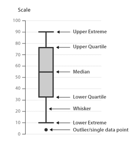
• Quartiles divide the data into three equal parts: 25th, 50th, and 75th quartile.
• Difference between third and first quartile is called the Interquartile Range.
• Interquartile range = length of the rectangular box.
• Outliers are extreme values and are shown on the vertical axis.
Time Series:
- A special type of line graph where the x-axis is always time.
Limitation of traditional Data Analysis
Data Analytics in Industries
Data analytics is being used in each and every industry for improving the performance of the companies, just like in the example of a cricket match where the captain and coach analyse the performance of the opponent team and then devise strategies for winning the match. If we begin to list down the areas where data analytics is being used, the list would be infinitely long.
Some of the major industries include:
Banking
Healthcare
Insurance
Telecom
Aerospace
Retailers
Internet
E-commerce companies
Limitations of Traditional Analytics
- Involved Huge Efforts, Time Consuming: The traditional data analytics involved huge efforts from the statisticians and it was very time-consuming, as it involved a lot of human intervention. This became a liability for the companies because of additional costs borne by the statisticians, and they failed to provide accurate results.
- Static Data Model: The models created by statisticians were static in nature, meaning they needed to be revamped and recalibrated periodically. This led to additional costs and performance struggles.
- Struggle to Manage the Exponential Growth in Data: With the exponential growth in volume, velocity, and variability of data, traditional analytics struggled to manage and integrate the data using their methods.
- Lack of Skilled Resources: Traditional analytics suffered from a lack of skilled resources. Companies found it difficult to hire good resources, and they lacked knowledge of advanced tools for efficient data analytics.
Rise of Machine Learning
- Human Intervention Reduced, Dynamic Model: With machine learning, the challenges faced by traditional analytics were addressed. ML uses complex statistical methods and modern tools for better and more accurate solutions, with minimal human intervention.
- Managing the Exponential Growth in Data: Machine learning tools (e.g., Python, R, Knime, Julia) efficiently handle both structured and unstructured data, a challenge for traditional tools (e.g., Minitab, MATLAB, IBM SPSS).
Limitations of Machine Learning
- Large Data Requirement: For training ML models effectively, a large amount of relevant data is required. Insufficient data can lead to incorrect predictions.
- Lack of Trained Resources: ML techniques require trained resources for understanding and interpreting results. Inaccurate or incorrect algorithm selection can lead to poor performance.
- Reliance on Results from ML Techniques: Sometimes there is too much reliance on ML-generated results, and human intuition or experience is overlooked.
- Treatment of Missing Fields: Missing data fields need to be imputed using ML techniques. If not handled properly, it may impact the results and accuracy of models.
Missing Data
Whenever the data is not available for certain fields, we say the data is missing for that field. It could be represented as a "Blank", "N/A", "n.a." (Not Available), or "-". For example, M.S. Dhoni’s bowling statistics in T20 internationals may show missing data because he hasn’t bowled in those matches.
As a data scientist, missing values are replaced with other values using techniques that minimize the impact on the model.
After ML, What Next?
With the progress in data science and computing, new-age technologies such as deep learning and AI are making breakthroughs. Researchers are constantly developing techniques that require minimal human intervention and provide more accurate results. Deep learning-based methods are reducing time and costs in data analysis.